
Using Reports and Explorers
Use date ranges, comparisons, filters and the Metric, Dimension, Attribution and UTM Explorers.
Updated 9 August 2026Use reports as a consistent analysis workspace
Incendium reports answer different questions, but they reuse the same core controls. Set the analytical context first, then interpret cards, charts and tables within that context. This avoids comparing values that use different dates, filters or attribution models.
Choose the date range, comparison and relevant population before looking for movement. The same chart can support a different conclusion when one of those controls changes.
Set the date range and comparison
The date selector at the top of a report defines the period used by its cards, charts and tables. Preset ranges are useful for routine analysis; use a custom range when it needs to match a promotion, launch, accounting period or other real event.
The comparison mode determines the baseline used for change values. Keep it consistent when moving between reports. A previous-period comparison answers a different question from a year-over-year comparison, especially where seasonality is material.
- Confirm the project timezone before investigating a specific day or hour.
- Use complete comparable periods where possible.
- Allow for reporting and integration delays when the range includes today.
- State the date range and comparison when sharing a conclusion.
Understand report filters
Filters restrict the population behind the result. A typical filter combines a Dimension, an Operator and a Value. For example, a Channel dimension with Equal and Paid Search isolates that acquisition group.
Some reports display active filters as chips near the top. Some chart or Explorer settings keep their filters until removed. Before investigating missing data, check the date range, active filter chips and configuration drawer.
The attribute used to divide the data, such as Channel, Device, Location or City.
Defines how the value is matched, for example Equal, Not Equal, Contains or another available comparison.
The specific member or threshold used to include the relevant data.
Read common cards, charts and tables
- Metric cards show one headline value and may include a comparison with the chosen baseline.
- Metric selectors change the measure shown by a chart without changing the rest of the report.
- Dimension selectors change how a section breaks the data down.
- Expandable sections reveal or hide a related group of charts and tables.
- Tables can be sorted by available columns and paged through when more rows exist.
- Totals describe the filtered population, not necessarily every record in the project.
- Chart settings can expose filters or presentation choices for that specific visual.
When a chart and table appear to disagree, first check whether they use the same metric, dimension, attribution model, date grain and filters.
Metric Explorer: begin with the measure
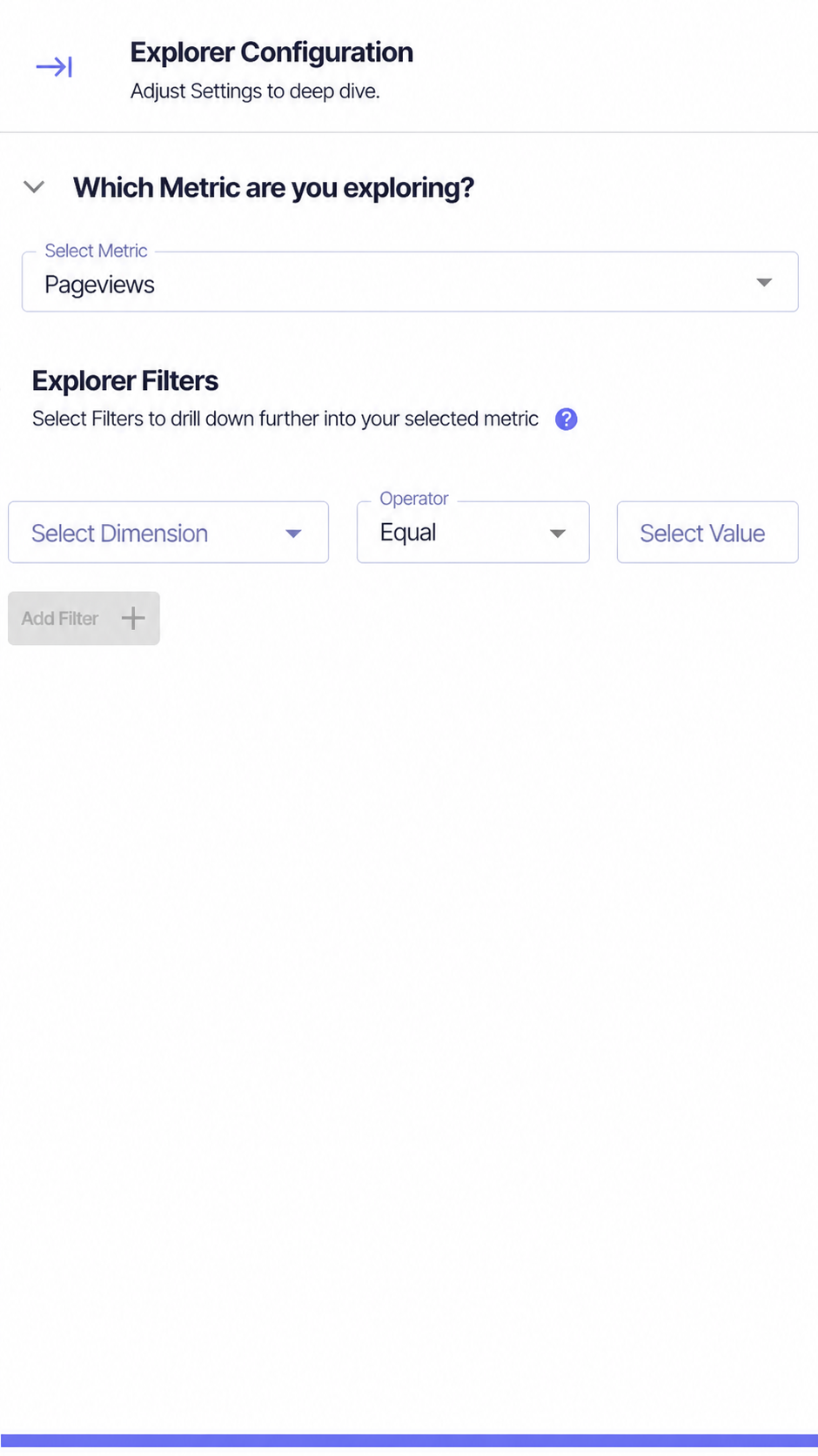
Use Metric Explorer when the question starts with a measure: revenue, Pageviews, Sessions, a Conversion rate or another available metric. Choose Configure, select the metric, then optionally add filters using Dimension, Operator and Value.
The Explorer prepares several useful views of the chosen measure, including its trend over time and breakdowns such as new versus returning, Channel, content, technology and geography. Individual sections also allow their Dimension to be changed.
Dimension Explorer: begin with the group
Use Dimension Explorer when the question starts with something you want to compare, such as Channel, campaign, Location or device. In Configure, choose the Dimension and optionally add filters.
The report then assembles relevant metrics for that dimension across Traffic & Acquisition, Funnel Performance, Engagement and Retention. This is useful when one business grouping needs to be understood from several angles rather than through one metric alone.
Attribution Explorer: compare credited contribution
Attribution Explorer is designed for questions about how Channels and touchpoints receive credit. Select the appropriate Analysis Profile, choose the attribution models to compare and apply Traffic Type or other active filters.
The bubble views can use measures such as EBA Revenue or Last Click Revenue for size, with optional labels. The table provides the underlying Sessions, attributed Conversions, sales, revenue, rate, profit and other available measures. Use it to compare models without treating Last Click as the neutral truth.
UTM Explorer: audit campaign parameters
UTM Explorer displays Source, Campaign, Medium, Content and Term alongside traffic, publisher and attribution measures. Narrow the table with the Source, Campaign, Content and Term selectors.
Use it to spot inconsistent naming, missing values, duplicated variants and publisher-specific parameter problems. If a value is mapped incorrectly, review Custom UTM Mapping; if sources need grouping, use Traffic Consolidate or Source Categories.
Choose the right Explorer
Use Metric Explorer to understand where, when and among whom it changes.
Use Dimension Explorer to compare the metrics associated with its members.
Use Attribution Explorer to compare modelled value across Channels or touchpoints.
Use UTM Explorer to inspect the parameter combinations entering reporting.