
The WYSIWYG Builder
Use the shared visual editor for Blocks, Templates and Pages.
Updated 9 August 2026One editor for Blocks, Templates and Pages
The WYSIWYG Builder is the shared visual workspace used to create reusable Blocks, arrange Templates and edit individual Landing Pages. Learning it once makes all three workflows faster and prevents the same controls being explained differently in several guides.
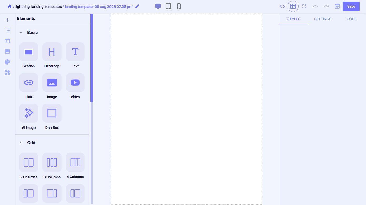
Set the page structure first, add content second and refine individual styles last. This produces cleaner responsive layouts than styling isolated elements before their surrounding Sections and Grids are stable.
Understand the workspace
Switches between Elements, the document tree, page settings and code, media, Theme settings and reusable Blocks or Components.
Shows the Block, Template or Page being edited. Drag resources onto the canvas and select an element to edit it.
Separates the selected element's Styles, Settings and Code.
Provides naming, responsive views, advanced code access, full-screen editing, undo and redo, Preview and Save.
Add Elements to the canvas
Open the Elements panel and drag the required item into position. The library is grouped by purpose:
Section, Headings, Text, Link, Image, Video, AI Image and Div / Box.
Two-, three- and four-column structures, plus weighted layouts such as 3/7, 7/3, 4/8, 8/4 and 3/3/6.
Form, Input, Textarea, Select, Button, Label, Checkbox and Radio.
Custom Code and Tooltip for requirements outside the standard element set.
Use Section as the main layout boundary and add Grids inside it where columns are needed. Choose the correct semantic element: use Headings for document structure, Link for navigation and Button for an action or form submission.
Use the document tree
The document-tree panel begins at Body and shows the nested structure of the current asset. Use it to select an element that is difficult to reach on the canvas and to understand which Sections, Grids and content elements sit inside one another.
- Keep nesting as shallow as the design allows.
- Use the tree before deleting a container so its children are not removed unexpectedly.
- Check that headings follow a logical hierarchy rather than being chosen only for visual size.
- Use clear structure to make later edits and responsive troubleshooting easier.
Edit Styles, Settings and Code
Select an element on the canvas or in the document tree. The right panel then provides three levels of control:
Controls the visual presentation of the selected element, including the applicable sizing, spacing, typography, colour and layout properties.
Controls element-specific content and behaviour, such as a link destination, media source, form attribute or another available property.
Provides element-level code access for requirements that cannot be expressed through the standard controls.
Prefer Styles and Settings where possible. They are easier for another editor to understand and safer to adjust across responsive views than custom code.
Build responsively
Use the desktop, tablet and mobile controls in the top toolbar to change the working viewport. Responsive review is not only a final check: revisit each viewport after a structural change.
- Confirm Grids collapse or resize in a readable order.
- Check that headings wrap without leaving isolated words.
- Make links and buttons large enough to use on touch screens.
- Keep images proportionate and avoid important content being cropped.
- Test forms with realistic labels, validation messages and input lengths.
Use full-screen mode when the canvas needs more space. Undo and redo become available as the current editing history changes; they are not a substitute for saving a known-good version.
Reuse Blocks and Components
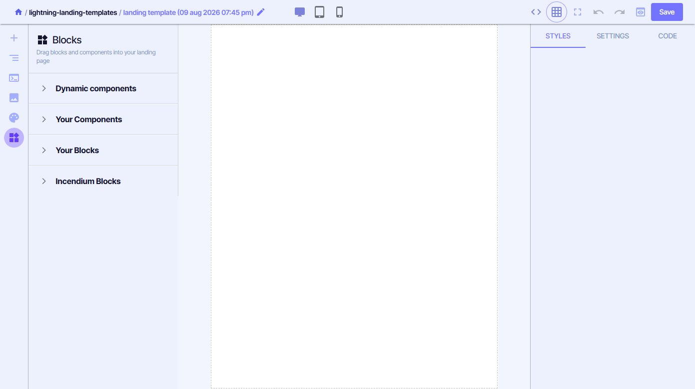
The Blocks panel contains Dynamic components, Your Components, Your Blocks and Incendium Blocks. Expand the relevant group and drag the resource onto the canvas.
Use a project-owned Component or Block when it already represents the required pattern. Incendium Blocks provide platform-supplied starting points. A Block can also be built directly from Elements and does not need to contain Components.
Use Theme settings inside the editor
The Theme panel exposes the shared Primary Color, Secondary Color, Text Color, Font Family, heading sizes, Body Font Size and Section container width. These are the same shared defaults managed in the project's Themes area.
Use the Theme for project-wide defaults and the selected element's Styles for a justified local exception. Too many local overrides make future brand changes slower and can produce inconsistent Pages.
Use the Media Library
The Media panel opens the project asset library. Existing media is shown with its filename, upload date and Image URL, with controls to use or manage the asset. Reuse the stored project copy rather than linking to a third-party asset that may later disappear.
- Use descriptive filenames before adding new media.
- Add useful alternative text when placing an image on the canvas.
- Choose an image whose dimensions suit the intended placement.
- Do not remove an asset until its use in Blocks, Templates and Pages has been checked.
Set SEO, favicon and head code
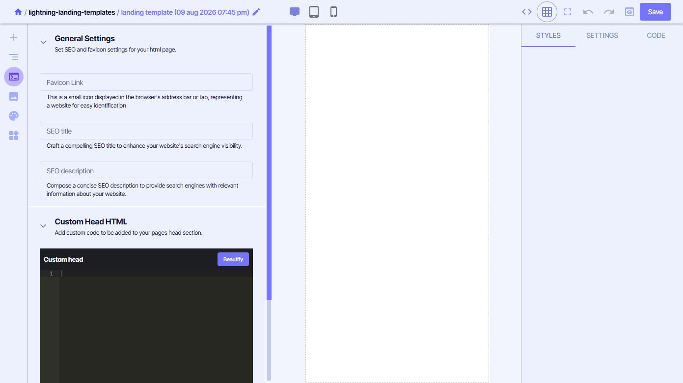
The page-settings panel contains Favicon Link, SEO title, SEO description and Custom Head HTML. The code editor includes a Beautify action and a separate Save control.
Write a unique title and useful description for the published Page. Add Custom Head HTML only when the requirement cannot be handled by the platform's normal settings or project tracking. Duplicate scripts can harm performance and create repeated tracking events.
Edit the full HTML, CSS and JavaScript
Edit CSS/HTML opens an advanced drawer with HTML (body content only), CSS and JS. HTML and JavaScript provide Beautify controls; CSS also provides Remove Unused. Closing the drawer applies its changes to the current editor state.
Review responsiveness, accessibility, security and page speed after a direct code change. Remove Unused CSS should only be used after previewing every state that may reveal styles dynamically.
Use AI as a starting point
AI enters the Landing Pages workflow in several places:
- Generate with AI is available when starting a Component or Block.
- Create with AI can generate a Page from a detailed prompt, optional Template and either a reference URL or uploaded inspiration image.
- Premium build mode uses a more capable, in-depth generation route for complex or creative Pages and consumes more credits.
- Create From Meta Ad uses an existing Ad plus a required Template to generate a matching Page, with an optional Smart link after activation.
- AI Image is available in the Basic element library for generating page imagery within the editing workflow.
Give AI the real audience, offer, required sections, tone, evidence, calls to action and constraints. A Template is useful when the generated result must keep an established structure. Review every claim, link, image, responsive state and form before saving or activating the result.
Preview, save and continue
Preview shows the current result outside the editing canvas. Save stores the Block, Template or Page. Pages also provide Save Copy as Template and Activate; those actions are covered in the Page and publishing guides.
Preview after meaningful changes rather than waiting until the end. The Builder can produce pages quickly, but the advantage comes from combining that speed with reusable assets, first-party measurement and a controlled publishing process.